The difference between RGB, CMYK and Pantone colours can be quite substantial. Here is a quick overview of the different colour types and how best to use them ...what is the difference?
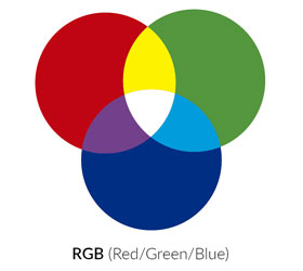
RGB is where red, green and blue are combined in various ways to produce a wide range of colours.
The main purpose of the RGB colour model is for the representation and display of images in electronic systems, such as television screens, computer monitors and mobile devices.
When all three RGB colours are combined and displayed to their full value, the result is a pure white colour. When all three colours are combined to the lowest value, the result is black. The red, green and blue of the RGB colour system use values from 0 to 255 to give you a whole array of colour options.
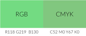
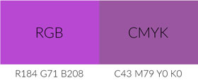
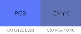
Something to bear in mind would be to try and refrain from using certain RGB colours, in particular, bright blue, green and red within design work as they are not well replicated when converting to CMYK to print your work. Converting RGB colours to CMYK can in a lot of cases result in the colour looking a lot duller in appearance, this is why RGB is not the best colour mode for producing designs for print.
Pros: Looks great on screen. Lots of bright colour options available.
Cons: Does not always reproduce well to CMYK for printing.
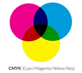
Made from 4 separate inks, cyan, magenta, yellow and key (black). These colours can be mixed together to create a whole range of colours.
As the go to colour technique for printers, setting up artwork in CMYK would mean less work and a better result from the finished printed material. As mentioned above, it is quite common for colour changes to happen if an RGB colour is converted to CMYK so it is always important to check your artwork before sending to print.

Although CMYK is the preferred choice for printers, there is only so much you can achieve when using a mix of CMYK. Because colour inks are mixed on the spot, a print job that you may have had done last week could appear slightly different when next printed depending on the mix of inks. With the importance of brand consistency, this can sometimes be an issue for businesses. The way around this problem would be to use Pantone colours, which guarantees that the colour will be the same every time it is printed.
Pros: Preferred choice for printers. Millions of colours available. Lower cost when printing large quantities.
Cons: Colour consistency across multiple jobs. Bright colours may appear dull.
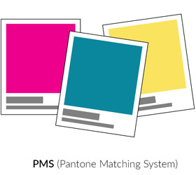
The Pantone Matching System (PMS) is a spot colour system that standardises colours and assigns each colour a number. Using these numbers helps printers and manufacturers to avoid mistakes like colour difference between the design and the finished product.
By using PMS colours, you can refer to a colour just by its number and offer more consistency to a brand. The most commonly referenced colours are in the Pantone solids palette. These colours are identified by three- or four-digit numbers, followed by a C (coated paper) or U (uncoated paper), for example Pantone 032 C or Pantone 032 U.
Although Pantone is great for the accurate reproduction of solid colours, Pantone inks can be expensive; so, if you are wanting to print a large quantity of brochures or other marketing tools, the costs can quickly add up. Also, spot colours cannot be used to reproduce photographs, so CMYK is still the best option for printing. You can visit The Pantone Colour Finder and pick a Pantone colour, this then gives you the CMYK, RGB and HEX code values of your chosen colour. Although this will not be as 100% accurate as using a spot colour, it is a more cost-effective option if printing multiple items on a large scale.

Pros: Excellent for colour consistency. Good for use on 1-3 colour projects such as logos and signage.
Cons: Can be expensive when printing large quantities. Spot colours are not suitable if printing material that contains photographs.
When having any print work done, it is good practice to consider how the choice of paper stock could affect the colour. For example, printing onto a silk or gloss coated paper will better retain any bright colours you have used within your design whilst printing onto an uncoated stock can cause colours to dull down. This is due to ink being absorbed more into uncoated paper more than it’s coated equivalent.
The Freebook Global Technologies Graphic Design team are primed and waiting to assist you with any print projects or creating standout colourful infographics or resources.